Data Visualization / Print Design / UI/UX Design
Aurize
Discovering connections within self-reflection
Overview
Journaling is an intimate process used for mindfulness, self-awareness, and daily tracking in mental and physical health. While there is a variety of methods for journaling, this project explores text-based stream of consciousness journaling using guided prompts translated into a digital tracking experience.
Aurize is a customizable journal data visualization app that provides insights and guided writing sessions.
-
This thesis was displayed at the graduating BFA Graphic Design Program’s Imagine That Senior Exhibition in 2022.
-
Chang Kim—Primary Advisor
Graphic Designer, SJSU ProfessorYoon Chung Han—Secondary Advisor
Interaction Designer, SJSU ProfessorCindy Duong—Tertiary Advisor
Brand Systems Designer, Creative Strategist -
How does the physical journaling experience differ from digital? What are the advantages and disadvantages?
What effective strategies are used in text analysis software or AI to collect data?
How can collected data be effectively conveyed through a digital experience?
-
Mobile App, Process Book
-
Adobe Illustrator, Adobe Photoshop, Adobe InDesign, Adobe Fresco, Figma, Procreate
Thesis Statement
Stream-of-consciousness journals are difficult to identify trends and patterns manually due to their free-flowing nature. Elevating the journaling experience by combining physical and digital technology would help users improve their self-awareness and self-care habits.
Discovery & Research / Data Visualization
Gathering the Data
Journal Survey
I conducted a survey to gain insight into users’ wants and needs. Based on a sample size of 17 people, aged 18 to 34 years old, the following are the common findings.
customization
to see how they improved
a space for expression
Users want:
encouragement in consistency
organization for topic types
a safe space to vent
relief from anxiety and stress
Users need:
How many times a week do you create entries?
Journal Samples
For a week, I collected 27 journal samples from volunteers tasked with writing entries based on fixed data topics of sleep, food, mood, work, relationships, and daily habits. I also provided page and entry guidelines as a baseline. Analyzing this data revealed user differences, as well as shifts between qualitative and quantitative data.
Any blank or lined paper
Min. paper size: 5” x 7”
Max. paper size: 8.5” x 11”
Page Guidelines:
Min. 1 page (no limit to number of pages/entry)
At least 1 entry/day
Any writing tool
Handwritten text only (no imagery)
Legible (crossed out lines are okay)
Entry Guidelines:
Brainstorming & Ideation / Data Visualization
Sketch after Sketch after Sketch
Inspired by Giorgia Lupi, I sketched multiple visualizations to create a system that is easily understood on a mobile screen. This meant exploring types of infographics and finding ways to visually represent multiple data points simultaneously.
This part of the project was a significant struggle. Compared to print, data visualization for mobile applications works more effectively when visual elements are simple due to the limited screen area. However, gestures (such as pinching, scrolling, and tapping) can be used to create an elevated layered experience.
Brainstorming & Ideation / UI/UX Design
Mobile Mockup Explorations
Form vs. Function
Early iterations had several issues with hierarchy, flow, and the effective use of infographics. I learned that the texture, shape, color, and complexity of the icons created for the data points needed to be simplified so users can quickly comprehend the information at a glance.
Screen Size
Samsung Galaxy Note 20
Final Designs & Deliverables / UI/UX Design
Information Architecture
Final Designs & Deliverables / UI/UX Design
The Final Product
Insights Tab
Insights presents users with a variety of infographics generated from data gathered from scanned journal entries. Users can tap through filtered modules to access secondary and tertiary levels that reveal AI analysis summaries of trends or connections between data points.
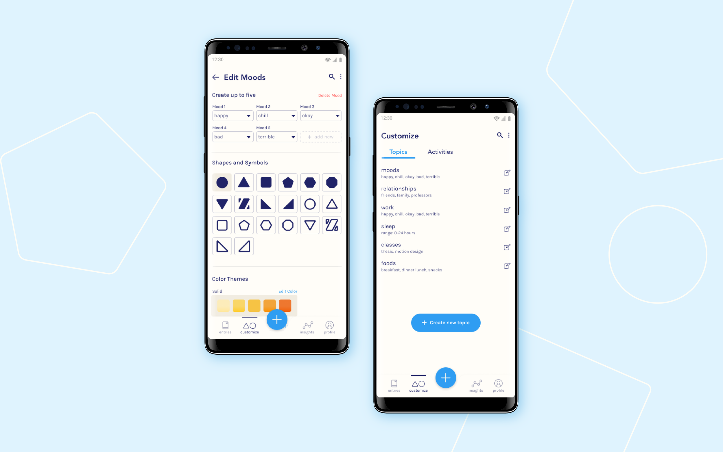
Customize Tab
Customize allows users to edit their moods, topics, and activities with preferred colors, shapes, and word choices. A user can select from a range of simple color themes and icons for specific charts.
Final Designs & Deliverables / UI/UX Design
App Walkthrough
Three flows have been created for this prototype: Customize, Guided Entry, and Insights. Guided Entry is a feature that enables users to follow suggested prompts to accompany a journaling session. After completing a written journal entry, pages can be scanned through the camera to be analyzed and translated into visualizations using AI.

Phone’s in the other room? Click here.