Branding / Logo Design / Print Design / Print Production
Spartan Daycare
Bringing a friendly face to caring space
Overview
Spartan Daycare is a well-established small business daycare that values play-based learning for children aged 1-4, providing a nurturing environment for both parents and children since 2016. The daycare is guided by its motto: “Made with Love.”
Rooted in strong core values of community, growth, strength, and transparency, Spartan Daycare approached with the need for a logo refresh and supporting print material that reflected its mission.
-
Graphic Designer, Print Specialist
-
The previous logo lacked simplicity and individuality, and didn’t accurately reflect the daycare’s values.
The existing visual identity needed a refresh to align with the new logo.
-
Design a logo that embodies the daycare’s strong foundational beliefs, balanced with the owner’s creative vision.
Rework the brand’s visual identity to develop brand consistency across different print materials.
-
Logo, Business Card
-
Adobe Illustrator, Adobe Photoshop, Adobe InDesign
Brainstorming & Ideation / Logo Design
Concepts & Iterations
Finding the Right Symbols
In the early stages, I explored experimental sketches by combining two or three symbols at a time. A list of keywords based on defined values and client vision helped guide research for reference symbols and brainstorm concepts related to the industry. Finding a visual solution that balanced the contrasting connotations of “Spartan” and “daycare” was a challenge.
Playing with Color
Many logo designs made for early childhood education often use a bright, colorful ROYGBIV color palette. Though fitting, having more than four colors risked the design becoming too busy and visually overwhelming. I explored monochromatic and triadic color combinations that included warm and cool hues. By doing so, I was able to bring in the color variety the client was looking for.
Shaping the Finer Details
The client emphasized the importance of the design being kid-friendly throughout the logo process. This meant there needed to be a visual softness that appealed to parents and children. Some early iterations fell short, but the client’s feedback helped refine the final design direction. The letter “C” was also extended to match the shape of the emblem.
Final Designs & Deliverables / Logo Design
The Solution
Spartan Helmet Plume
Divided into six sections to represent the learning pillars of Spartan Daycare: language arts, math, arts and crafts, gross and fine motor skill development, dramatic play, and music appreciation. Texture inspired by an inch ruler.
Greek-Inspired Leaves
Represents victory and achievement to highlight the accomplishments of children in the daycare.
Heart
Represents love and care. Used to emphasize the daycare’s motto: “Made with Love.”
Typography & Color
A bold type was chosen and modified to represent strength. The range of warm and cool color combination also plays into diversity.
Keywords
Growth
Learning
Transparency
Caring
Play
Strength
Outdoors
Diversity
HEX
#DA2F6F
CMYK
10, 95, 30, 0
HEX
#F3BA26
CMYK
5, 30, 95, 0
HEX
#69BFC1
CMYK
55, 5, 25, 0
HEX
#450627
CMYK
45, 95, 50, 65
Final Designs & Deliverables / Print Design
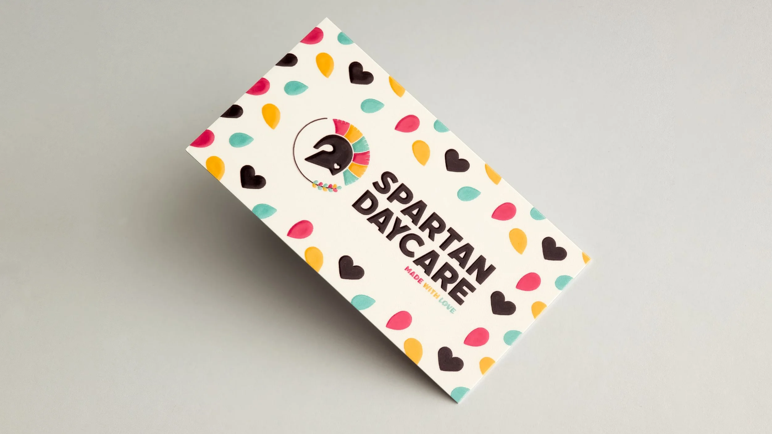
Business Cards
For business card, I aimed to create a design that was eye-catching with a professional, warm friendly vibe. A retro-inspired typeface was used to contrast the bold type with a human touch.
The supplemental pattern takes elements from the logo itself and inspired by the concept of sowing seeds. This symbolizes the ideology of Spartan Daycare cultivating young children’s early development for strong futures.
To attract new customers, a QR code linking to the client’s website was added. While there were many paper finishes for the business card, a raised spot UV option was selected for a premium, tactile feel.
Print Specifications
4/4
3.5 in. x 2 in.
16pt Coated
Silk Lamination
Raised Spot UV
Color
Size
Weight
Coating
Finish