
Adobe Creative Suite
Image-making
Photography
Print Design
Procreate
5 Covers: On Y Va
Aug. 2021–Oct. 2021
The purpose of this project was to create a remix of an original, historically significant poster chosen from a provided list. In other words, translate the design five different ways while incorporating my own narrative in each iteration and then further refine one direction. The final poster design was printed at the original size, 31 1/2 x 42 1/4 inches. Analyzing the original designer’s rhetorical approaches and ideology were helpful in drafting new versions. It inspired yet challenged my design thinking in visual communication.
Final printed poster.
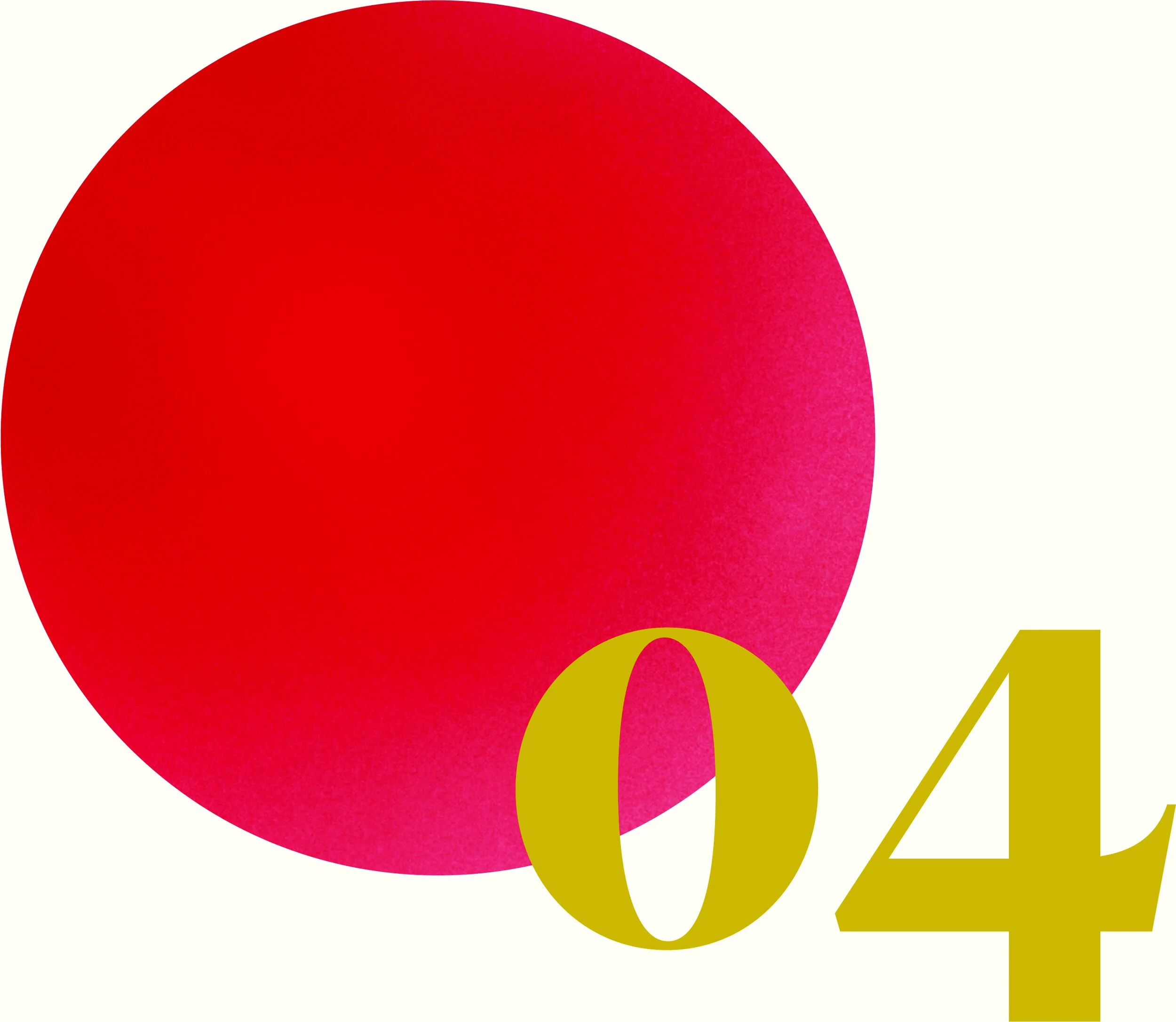
Iteration 2 from the final five iterations is the direction I chose to refine for printing. The combination of photography, illustration, and my own twist on the narrative was the most effective based on feedback from my peers.
Iteration 3
Iteration 1
Iteration 5
Iteration 4
Design Process
The process started with conducting research and analysis on the poster I chose: ON Y VA by Grapus. With the help from Prof. Diane Lee, the poster's English translation is "Youth festival organized by the monthly Avante Garde of the Movement of Young Communists in France. Here We Go! Everyone to Ivry. 4, 5 June to the festival. For change!".
This helped in finding the historical significance of the propaganda poster and identifying the visual rhetoric employed by Grapus. While it heavily relies on typography, it uses metaphor and pun to convey the message of its patrons, the French Communist Movement (MCJF), to recruit new members. It plays on the political belief that individuals should be able to interpret their own future instead of following traditional institutions. Similarly, the colorful text against the background is meant to be an illusion for a window into a "new world". This research was presented to peers for better feedback in the next stage of this project.
During brainstorming, I created thumbnails with descriptions to jot down a variety of ideas before picking out what I wanted to bring to the next step. Nearly all of the posters were made using combination of Procreate, Photoshop, Illustrator, and photography. Throughout the tactics, I tried to maintain a rainbow palette and language to have a resemblance to the original. The first tactic is a map visual of the text inviting the audience to Ivry as an attempt to use more imagery. The second tactic is changing the narrative to have the audience create their own future in a way that they envision by using recycled papers and cardboard.
The third tactic is influenced by Ivry architecture, and the original intention of allowing an audience interpretation of a window. The fourth is meant to create more movement and flow like a gathering. Lastly, the fifth is meant to be more imaginative in a clouded mind. Its narrative changes to "here we go. open your mind for change!" in French. The final revised poster is based on tactic #2 because it expands from one location to reach a wider audience.
I learned the difficulty of creating five different interpretations using a variety of approaches to make it feel like it's from separate designers. It also taught me the importance of inserting my own narrative into the work because it allows for more interesting solutions. If I were to further improve these, I would explore more adjacent meanings from the original to create unconventional compositions.

Hand-crafted type experiment: paper

Hand-crafted type experiment: paper

Hand-crafted type experiment: tulle

Hand-crafted type experiment: ink

Ink experiment closeup: Y

Ink experiment closeup: A