Data Visualization
Illustrator
Google Suite
Jan. 2021–Feb. 2021
This is a two-part project that made students take a closer look at their media usage within a 24-hour period. The first part required us to collect qualitative and quantitative data, and visualize it into a double-sided infographic on 8.5 x 11 in. paper with a two color restriction. I recorded my data in 15 minute intervals throughout my Friday. Part two is a figure/ground and tetrad based off a frequently used media. This project helped me learn how to collect, organize, and build a narrative around complex data.
The Golden Weekday
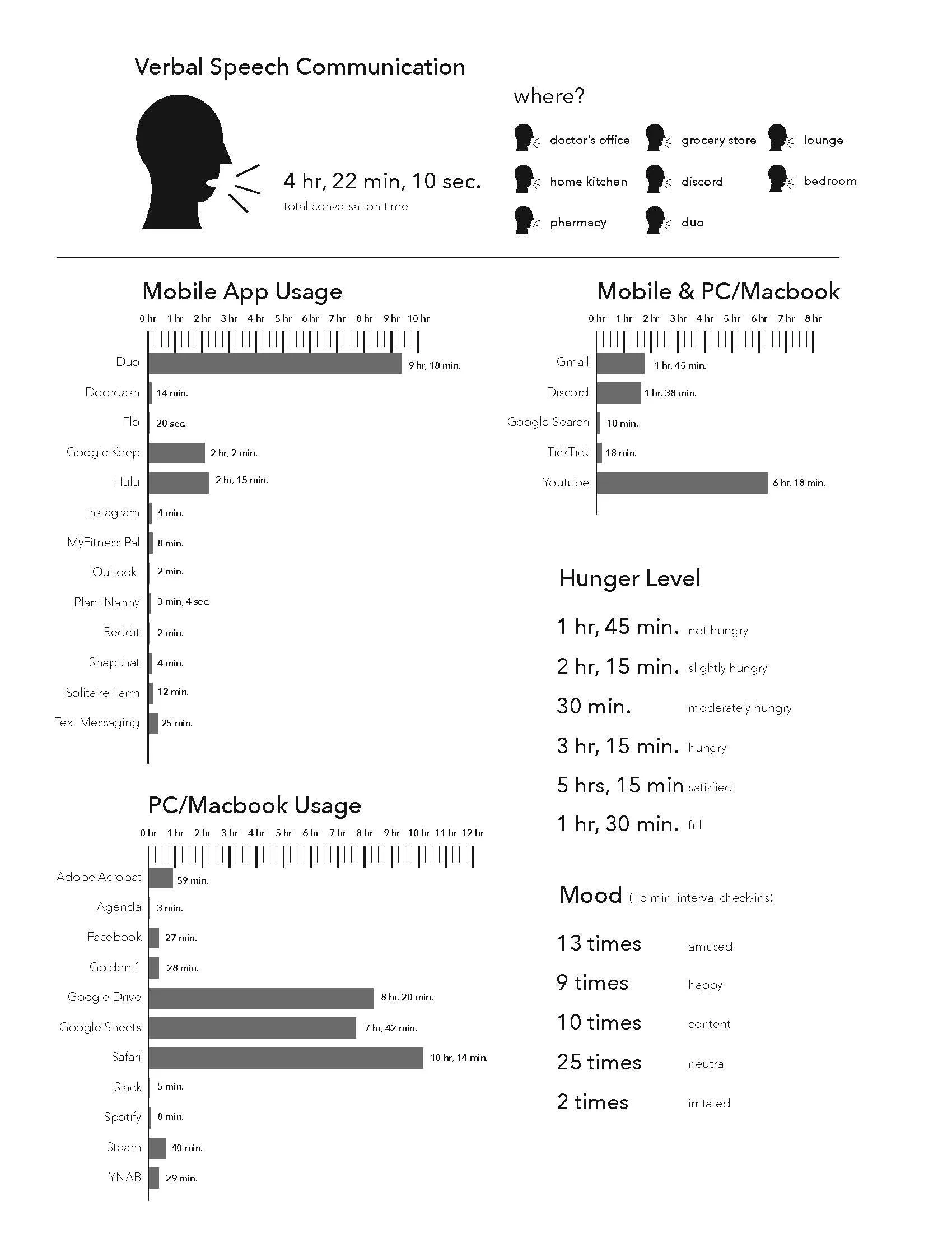
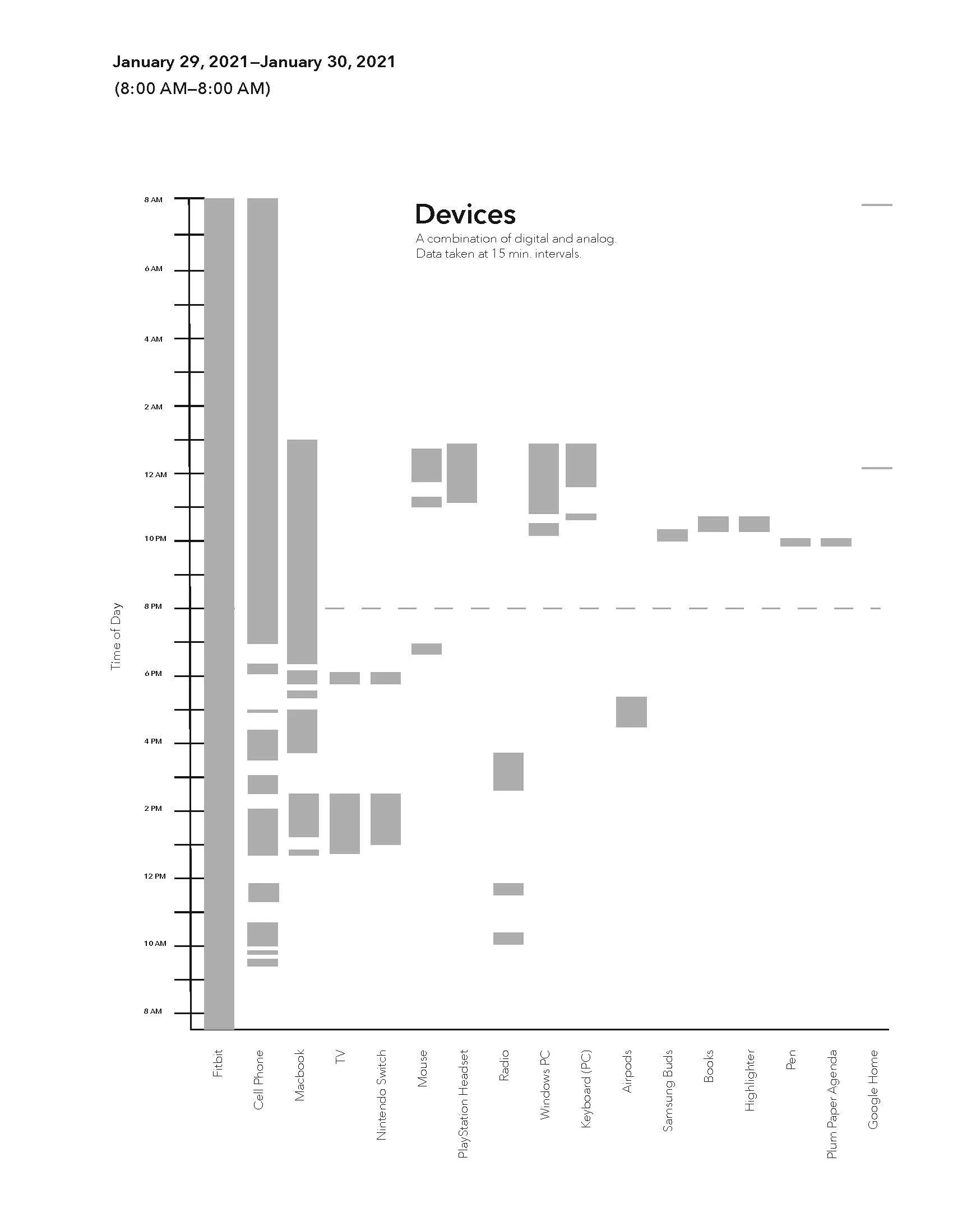
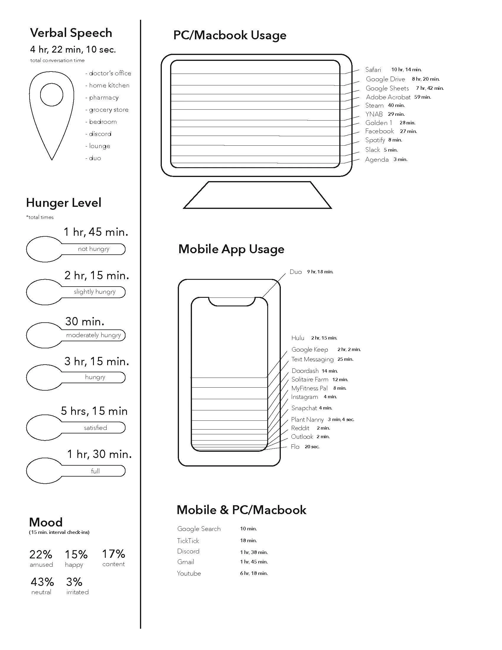
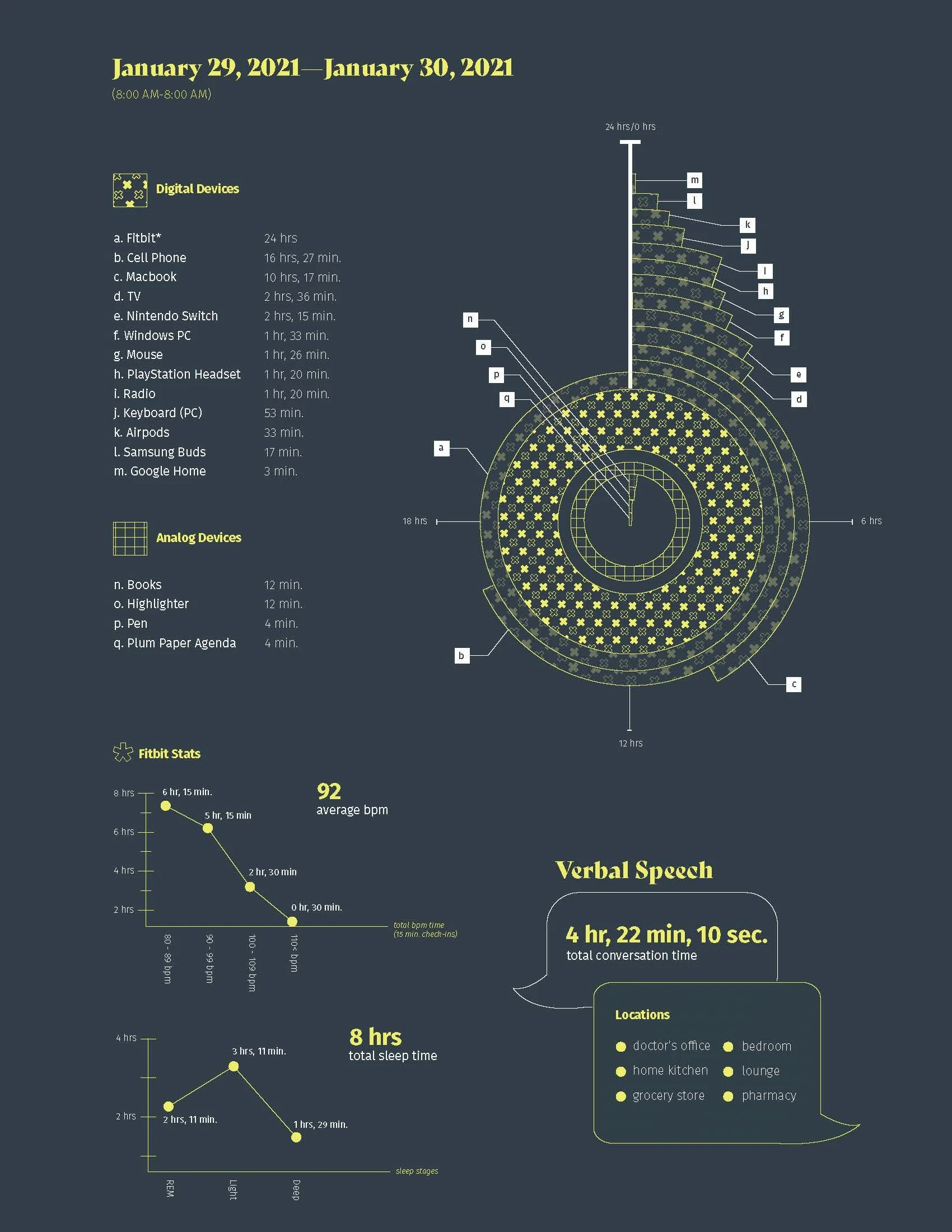
Part 1 (front and back).
Part 1 required at least three qualitative data points. I chose speech time, locations, mood, and hunger level to give deeper insight of my personal life.
Part 2 (front and back). Analysis of a frequently used media.
Design Process
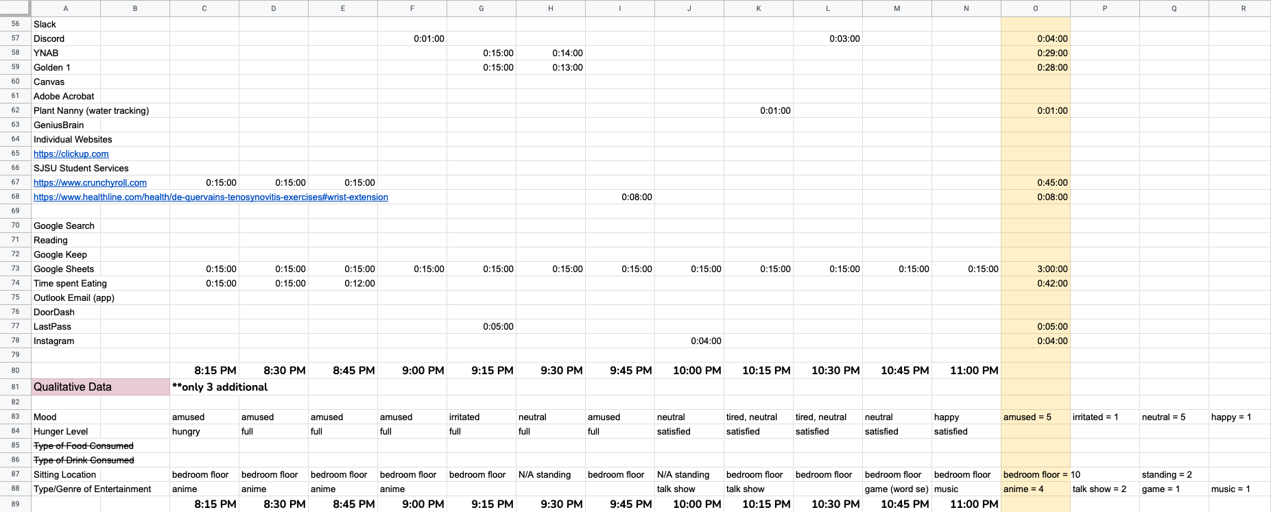
This project was based off our readings of Marshal McLuhan's Understanding Media: The Extensions of Man. The purpose of this project was to become aware of nested media (analogue and/or digital) being used simultaneously within our daily lives. I used Google Sheets to record individual devices/services including qualitative data at 15 minute intervals on a Friday. I had no classes or work that day which allowed me to get a good amount of data from an assortment of media.
After I finished recording, I calculated totals to find variety for when I made my 3 initial iterations. I created three versions increasing in the complexity. The first iteration is very literal and intentional to help me get a base idea of what the data looks like and how it would relate to each other. From there, I was able to branch into other methods with the third iteration being the idea pushed forward to the next phase. I used contrasting typefaces to differentiate titles from body text, and created textured patterns to make each graphic unique. Different types of graphs were used to keeps readers engaged, and provide multiple points of entry. I decided to use pattern and iconography to easily distinguish each data group because of the two color limitation. It took several rounds of iterations to find a visual balance in the patterns for an easy point of entry.
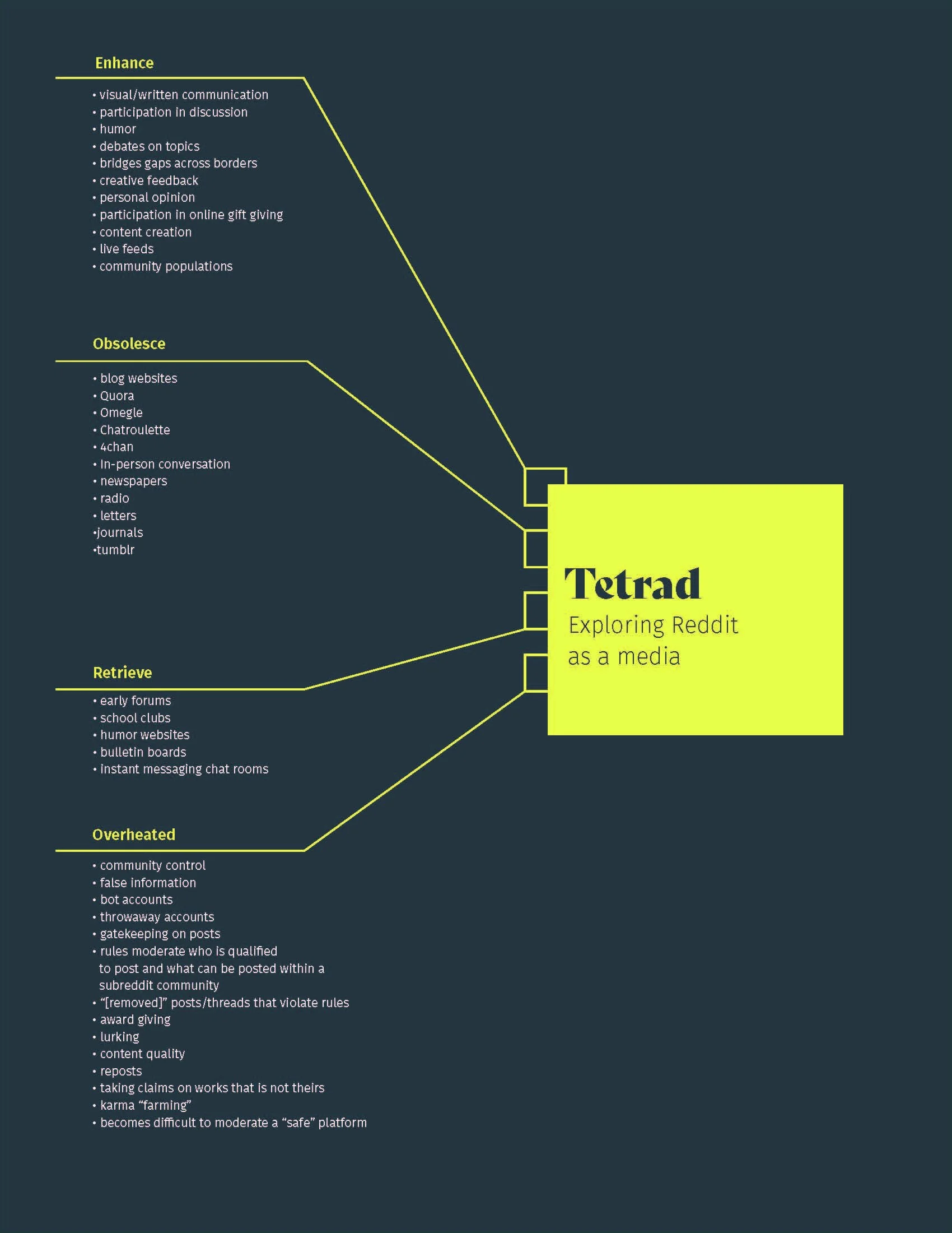
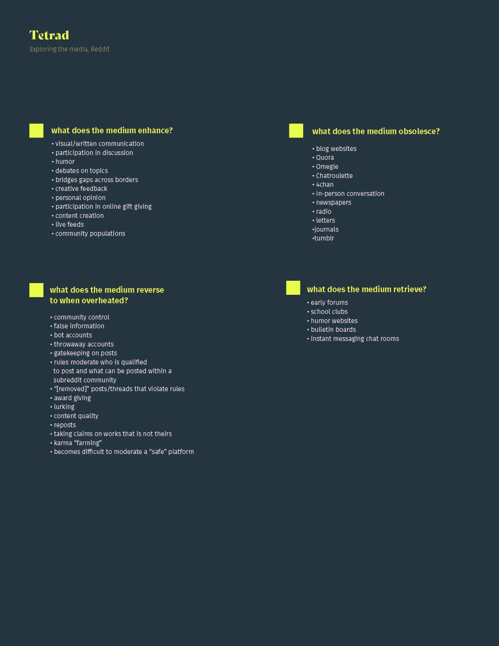
Part two of the project required a figure/ground and tetrad continuing from part one. We had to analyze a frequented media from our individual data from a hypothetical viewpoint. “What if _______ had disappeared?” and “How does it affect other media?” were a few of the questions we asked ourselves. In this section, I used Reddit, a platform that I previously frequented during this time. The figure/ground page covers what would be lost or affected if Reddit had disappeared from existence. The tetrad goes over four points: enhance, obsolesce, retrieve, and overheated. These sections uncover what the medium improves, pushes behind, originates from, and its downfalls.
Data spreadsheets
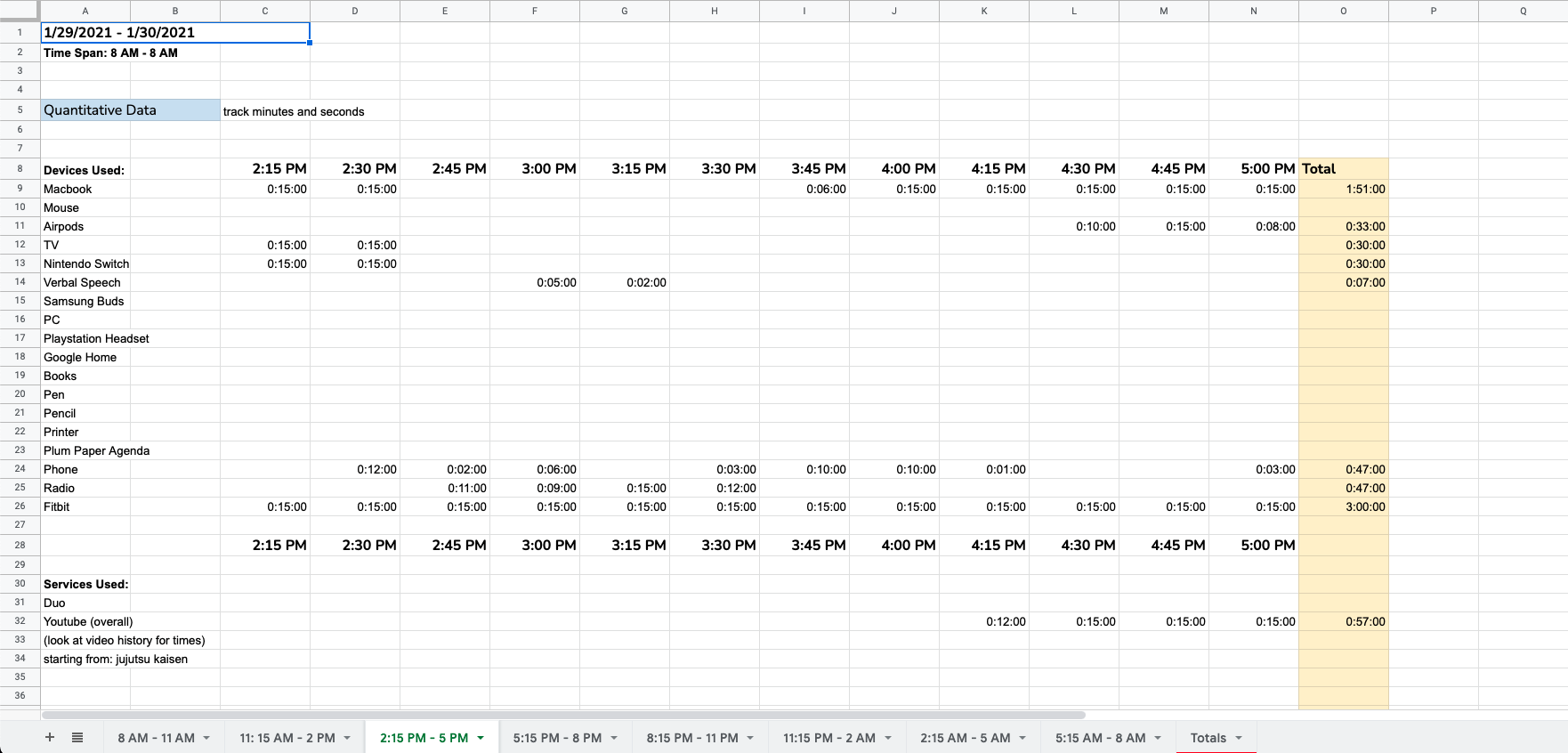
Data spreadsheets

Data totals
Initial Iterations (direction 1 back)

Initial Iterations (direction 1 front)

Initial Iterations (direction 2 front)

Initial Iterations (direction 2 back)
Initial Iterations (direction 3 front)
Initial Iterations (direction 4 back)
Iterations of parts 1 and 2.