

Branding
Fusion 360
Illustrator
Google Suite
Mellowful
Aug. 2021–Oct. 2021
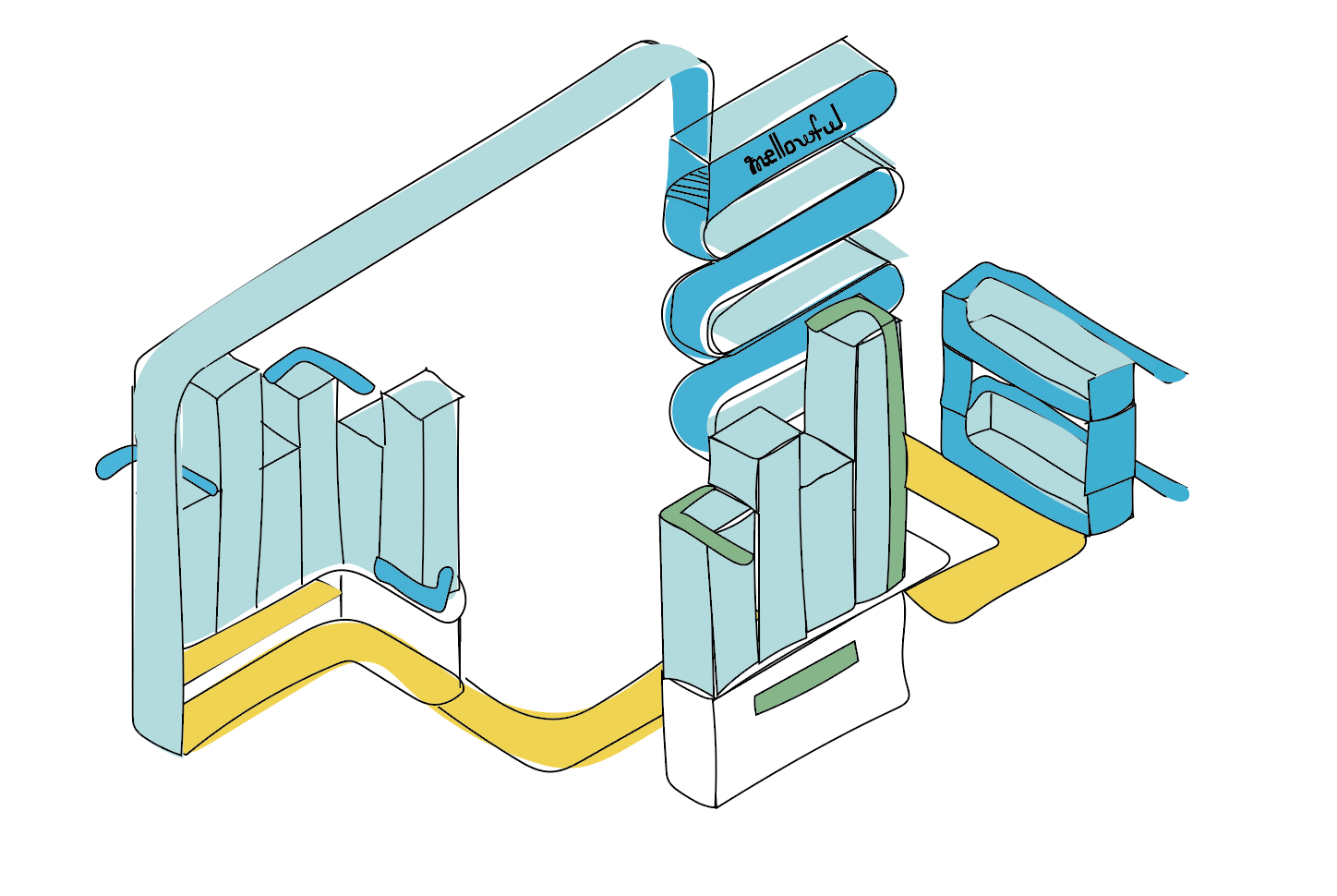
This point of purchase branding project’s goal was to address the issue of food insecurity. The project was a presented opportunity to include our work as part of Taste of Home’s art exhibition, New Kinships: Community Dialogues and Interdisciplinary Connections, at SJSU’s Natalie and James Thompson Gallery. Solutions to this problem was open-ended, allowing for different directions, methods, and systems. Mellowful is a bulk food and refill station that provides a variety of ingredients and essentials for a diverse community.
Dry goods holds dried foods, and herbs & spices. Hygiene contains laundry, bath & body, and cleaning. Monthly selection is a rotating inventory of seasonal and special products.
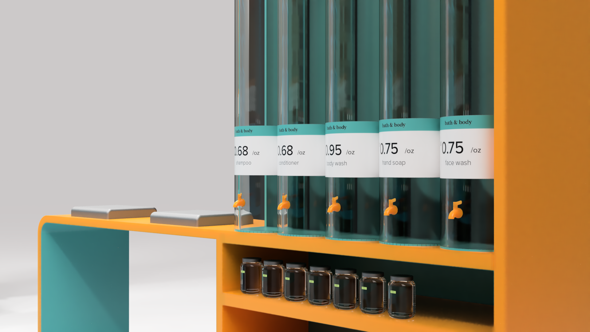
Detail of bath & body section.
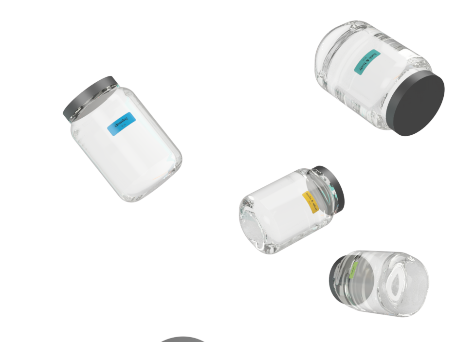
Detail of dry goods, and herbs & spices dispensers.
Mellowful’s Mission:
Our mission is to create an inclusive space to gather essential needs, and boost awareness of affordable sustainable lifestyle practices for a better well-being.
Design Process
We conducted initial group market research to get an understanding of our audience of the issues they face. This research was presented and shared to other peers as a resource. Each group decided on their own areas of interest to look into.
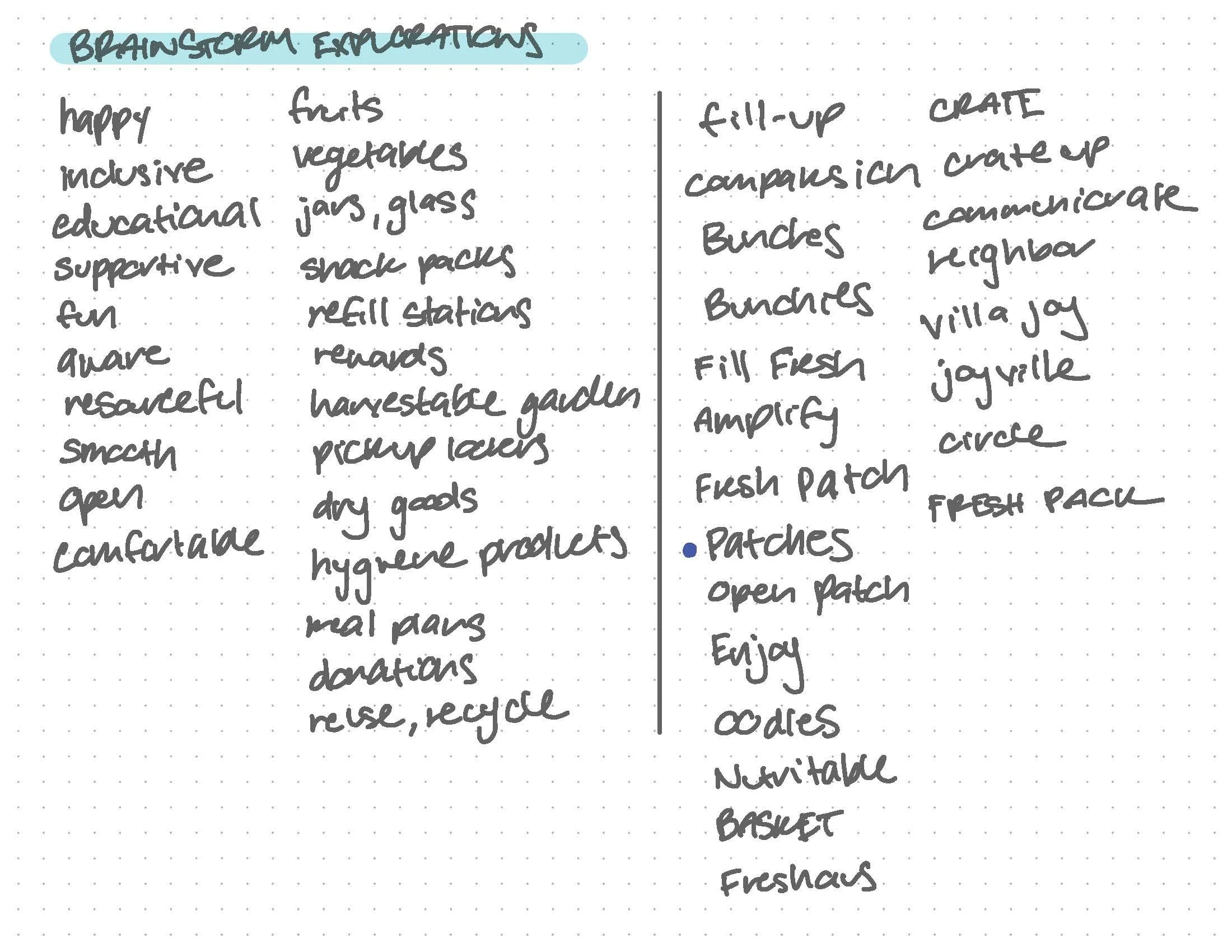
Before creating iterations, I went through the group presentations posted on Slack to identify and organize potential problems to consider such as stigma, cost, and level of food insecurity. From there, I was able to start conceptualizing ideas. The first few concepts were rough, especially since the idea of a POP was new to me. It took a bit of time to think about the space in 3D form while also considering ADA guidelines. I initially thought of a garden with refill stations, but it turns out that may require much more space. In reality, the 10ft x 20ft area was much smaller than I expected, so I narrowed the scope to refills. My brand idea started from Patches to Fillosophy to Honeycomb to Mellowflow, finally landing on mellowful. The name is meant to reflect the actions and vibes a customer would experience when visiting the refill station.
I continued onto creating structure concepts and going through several revisions after helpful feedback from Prof. Joe Miller and my peers. The most difficult part of this project was learning Fusion 360, but in the end resulted in great renderings. My final POP site contains three sections: dry goods, hygiene, and a rotating selection that would be used for new items. I created labels for each container with prices and names to distinguish each colored tower's product. Details such as refill towers, spigots, levers, and scoops were all referenced from images found online. Our final deliverables for the exhibition was a 3-minute video of our process book and 3 image render slideshow.
Page from research brainstorm
Page from research brainstorm
Initial iterations: Patches
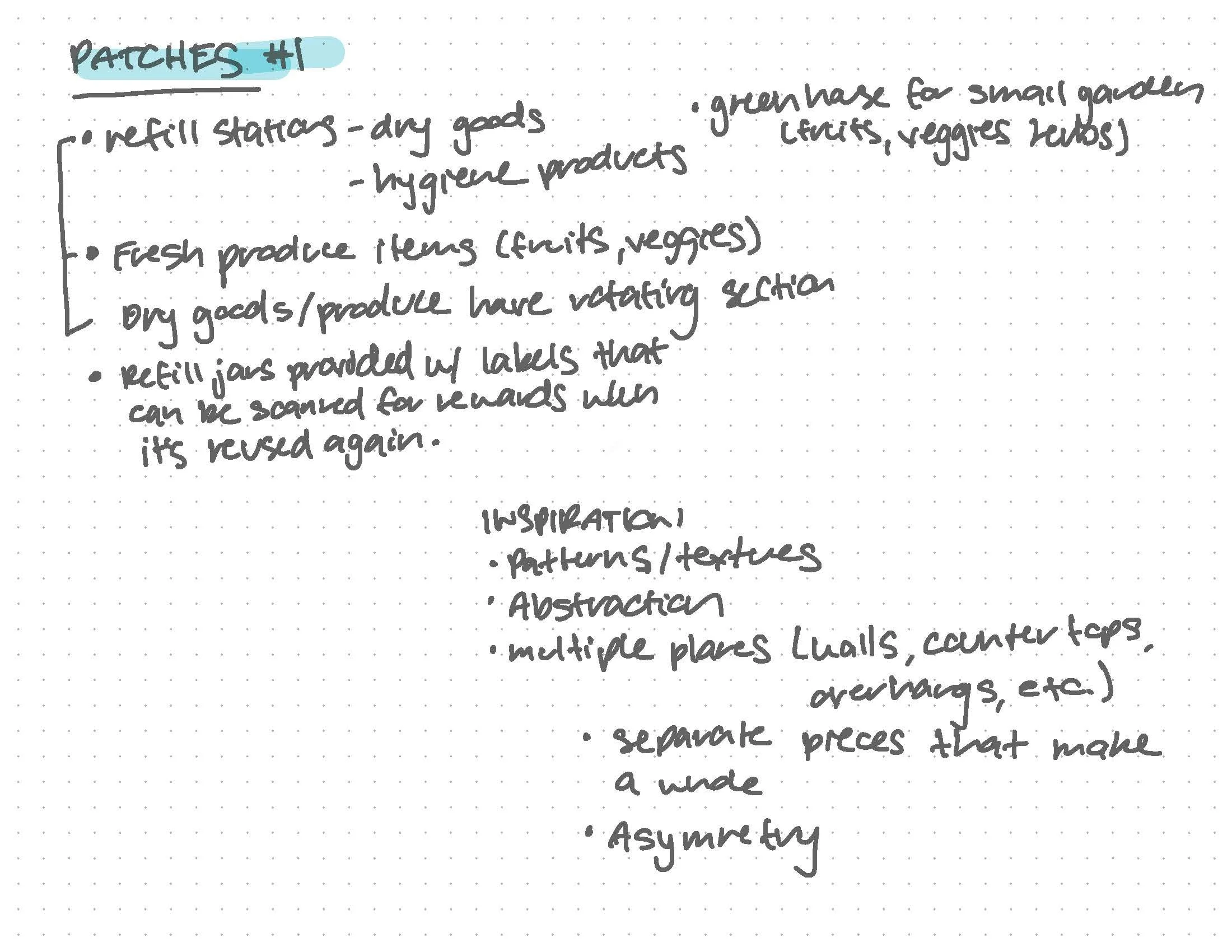
Initial iterations: Patches
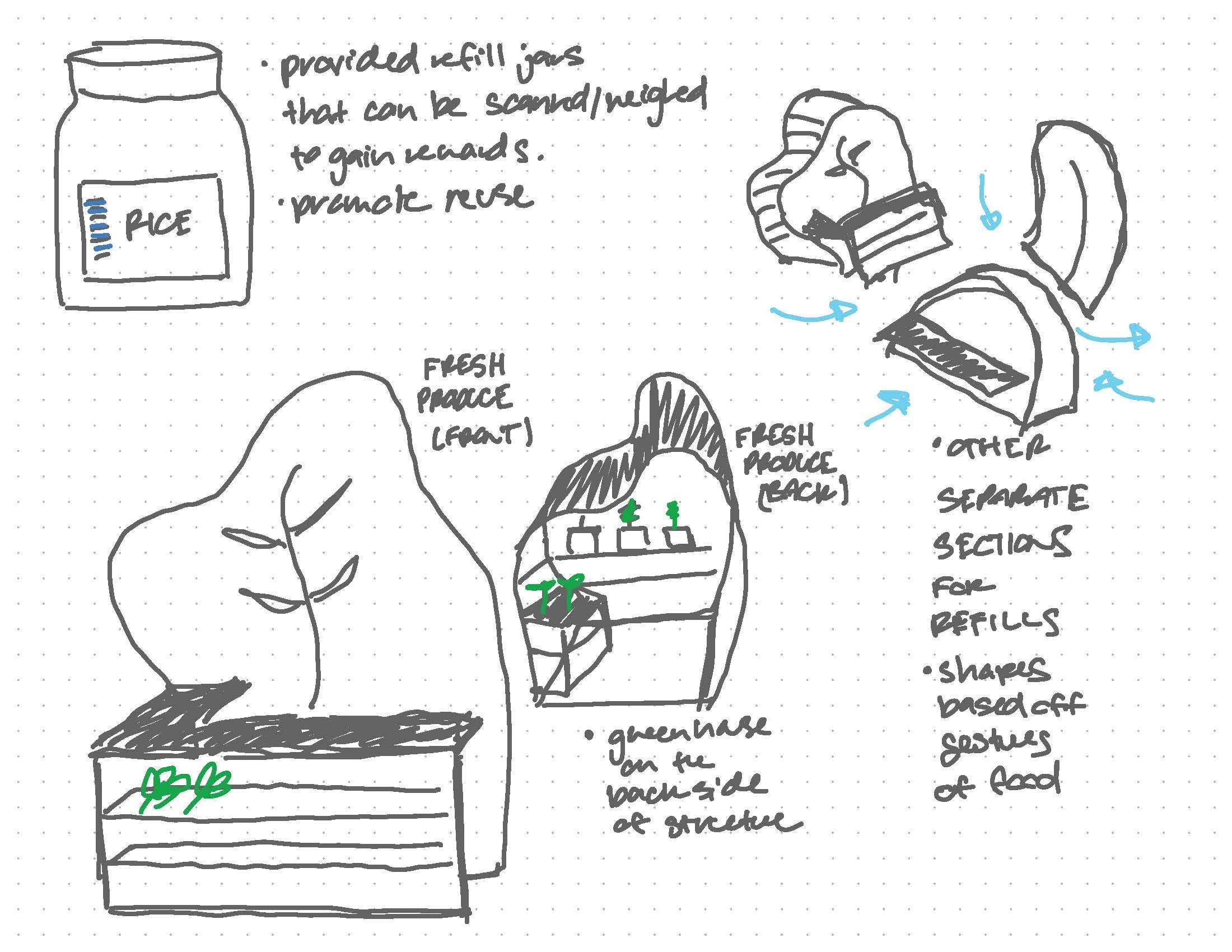
Initial iterations: Patches
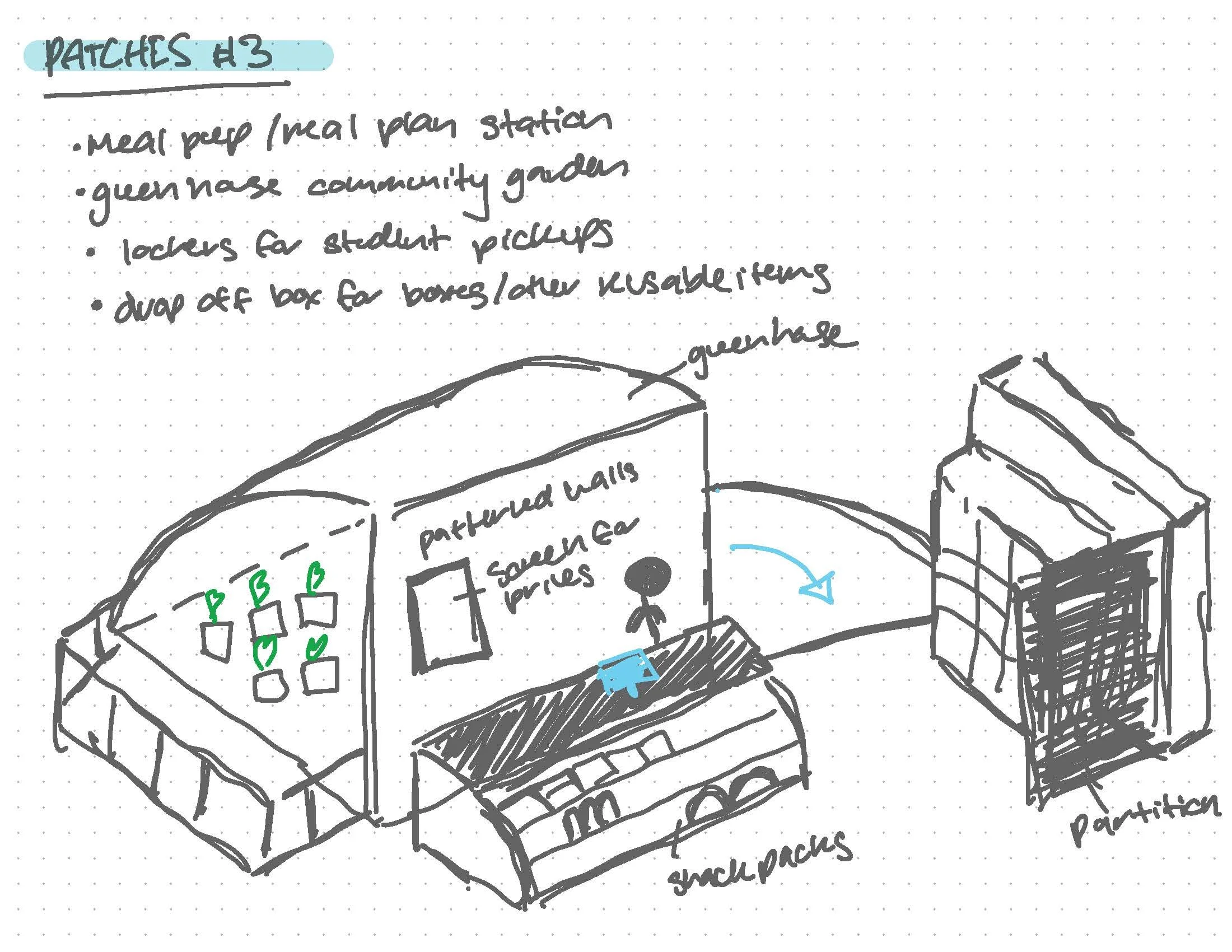
Initial iterations: Patches

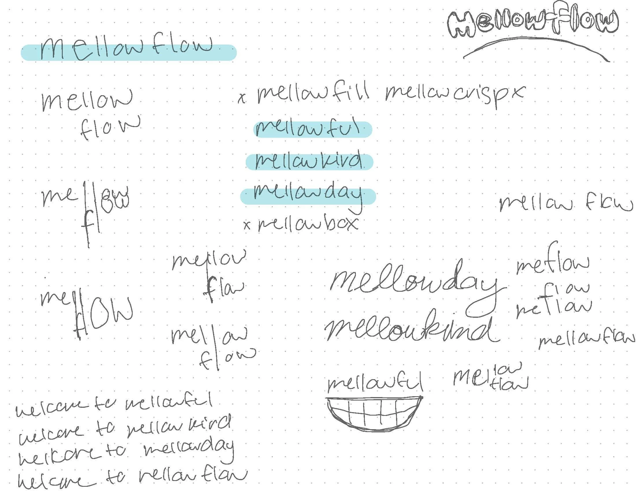
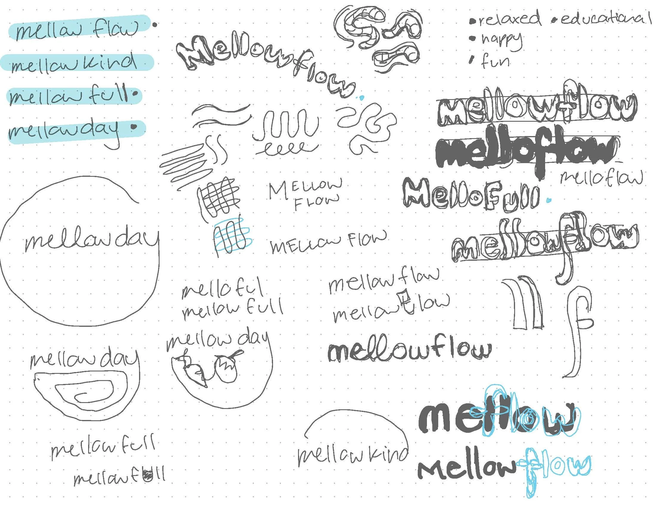
Branding brainstorm

Branding brainstorm
Initial logo sketches
Initial logo sketches

Initial logo sketches

P.O.P. structure brainstorm

Iterations towards final solution
Final logo

Color variation: Zesty Orange

Color variation: Sunshine Yellow

Color variation: Melon Green

Color variation: Clean Teal

Color variation: Bubbly Blue
Isometric sketch
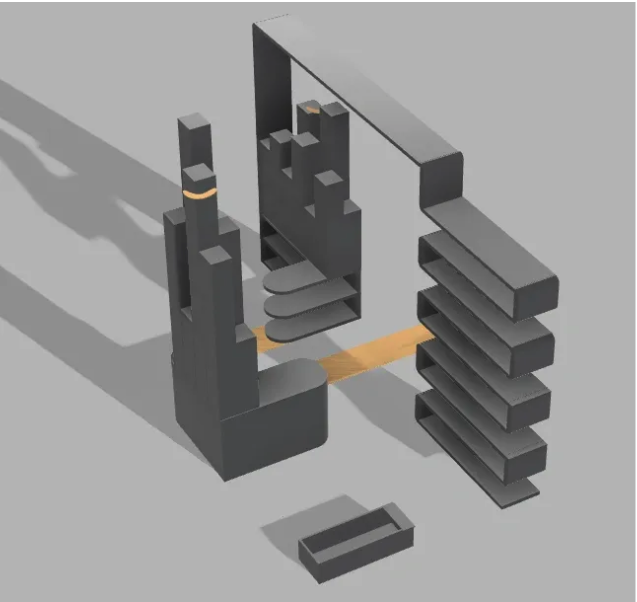
Fusion 360 render (Iteration 1)

Fusion 360 render (Iteration 3)