
Mar. 2021–May 2021
The purpose of this project was to create a digital and print archive experience for the University Art Collection curated by Alena Sauzade and Cynthia Cao from SJSU's Natalie and James Thompson Art Gallery. At this time, the UAC online database was being developed for public viewing since artworks were unable to be physically displayed. This was a team-based project where each group in the class developed their own concept. My team’s design concept encourages users to explore the collection through an interactive website, mobile app, printed matter, and swag.
University Art Collection
Adobe Creative Suite
Branding
Print Design
UI/UX
Collaborators
Dana Nissan
Ryan Parajas
Final logo lockup created by Ryan Parajas.
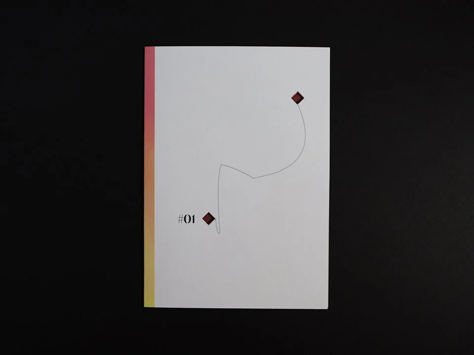
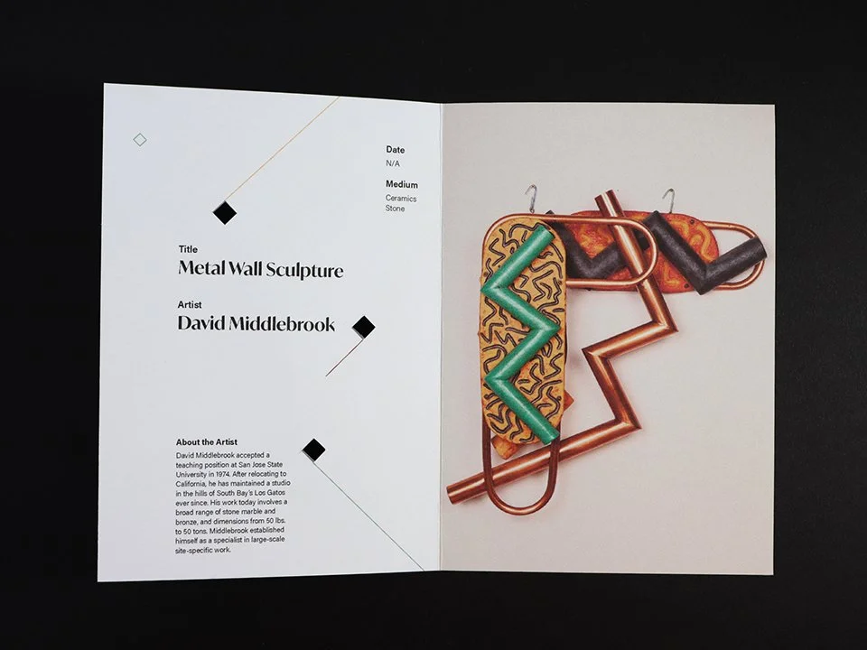
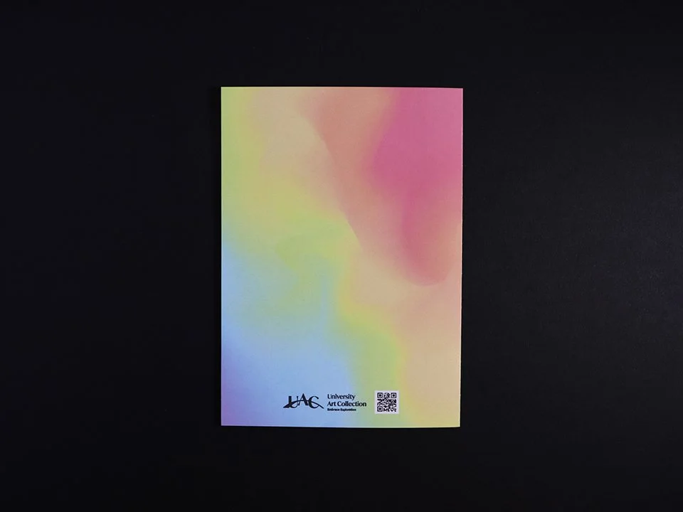
Final printed matter created by Dana Nissan based on my initial iterations and concept. Two-fold brochure series consisting of an artwork from the collection. Diamonds can be cut out to reveal image through the cover, playing on our tagline “Embrace Exploration”.
Three brochures were made to show how each design is unique based on the artwork’s color and composition.

(Home Page) Users have three options to explore the website: search bar, color, and random.

Color search allows the user to find an artwork by tapping on the gradient.
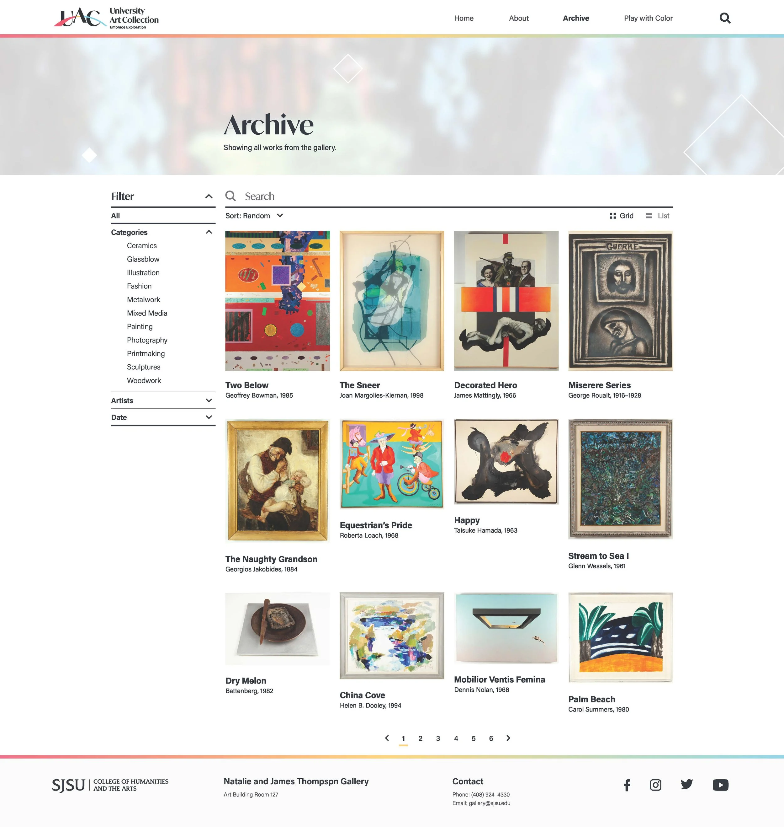
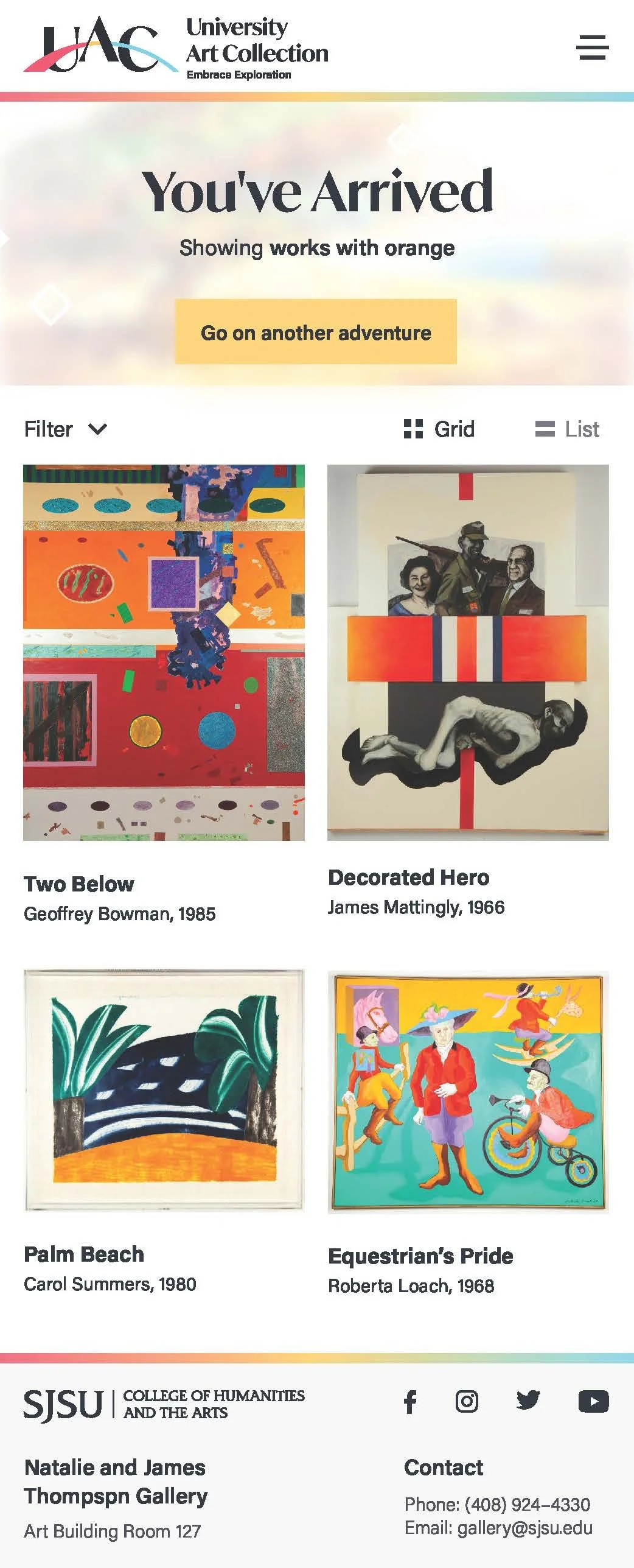
(Archive Page) Users can use search function or filter.

Artwork Details

Home page (mobile)

Color search (mobile)
Take me anywhere search function (mobile)

Artwork details (mobile)
What does “Embrace Exploration” mean?
Embrace Exploration is meant to motivate audiences to go beyond initial perspectives and find new connections.
Design Process
Each group was assigned a research focus to understand different types of archive experiences through museums, galleries, collections, and user profiles. My group focused on Print/Hybrid Experiences of Archives or Museum Collections. In this part, we created a Google Doc to list sources we've found and discussed which works best fit with our topic. Each member took on about 3 works to further research. Our collective research was made into a presentation for the class to use as reference. From there we went into working on our design proposals.
For the first few weeks, each of us explored our own idea for brand vocabulary, digital experiences, and printed matter. We did this to find several solutions for a direction we can combine together moving forward. This part in particular was a learning process for me because we maintained the exploration phase much longer than we expected. It took some time to create a cohesive branding experience where all the elements worked together in harmony. Some base ideas that I had that were revised in the final deliverable was the fun language of "going on an adventure" when being taken to different artworks within the digital experience, using a motif for branding, and a series of die-cut brochures. We struggled in the beginning in creating an experience that would reach our target audience of students. What would they like to experience when viewing this collection? Initially, our ideas were straightforward, but after reviewing other group work, we brainstormed ways to create more interest.
After agreeing on a direction, we divided the work to work on iterations. Dana and Ryan worked on website/mobile while I worked on printed matter. In the final mockups, Dana refined our printed matter while Ryan worked on the website and branding. I supported with feedback and editing our proposal. Our group held together by supporting one another and utilizing our strengths through consistent feedback and communication.
Our concept’s final deliverable followed Ryan’s branding guidelines because it maintained the elegance yet playfulness we wanted. It also allowed us to combine the diamond motif with the color spectrum concept across both digital and print experiences. It also aligned well with my tagline "Embrace Exploration". In the end, our digital experience allowed users to explore the site through color while the print experience allowed visitors to collect and interact with different artworks from the University Art Collection. This project showed me the importance of exploring ideas, revising, and remixing with others to find the best possible solutions.

My initial iterations for printed matter.