Adobe Illustrator
Figma
UI/UX
Heuristic Evaluation: Michaels
Mar. 2021–Apr. 2021
The objective was to learn the process of deconstructing an existing product experience's strengths/weaknesses and reconstructing it into an improved experience for a chosen user flow. Partners were randomly assigned and required to choose a product, create an architecture map, identify a flow to improve, create low/high fidelity flow, conduct user interviews, and create a digital prototype. The product flow my partner and I chose was Michaels' mobile app shopping experience because of its poor hierarchy and navigation. We worked through two flows within the shopping experience (shop tab and search bar) to cover the different methods that users would use to find a product.
Collaborators
Sylvia Ow-Yang
Redesigned home and item results screens.
Design Process
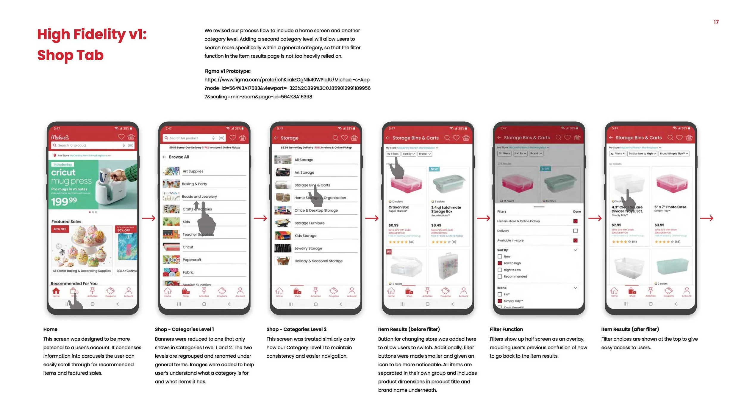
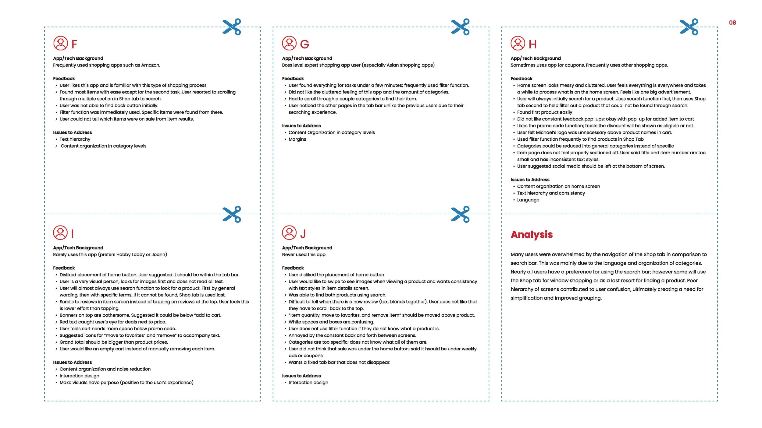
Before working on iterations, we conduct research and analysis of the Michaels app. A significant pain point we both noticed was finding a product we needed. In the original shop tab flow, categories were disorganized with shortened labels and went through multiple levels before arriving at the product result screen. The result screen had several competing elements in typography and imagery causing a conflicting hierarchy (a consistent issue within the flow from home screen to checkout). Once we decided our user flow, we conducted user interviews to gain insight on their background and feedback to identify other issues we may have missed. We asked all interviewees to find two products using the search bar method first and the shop tab method. Nearly all were overwhelmed by the shop tab navigation in comparison to the search bar mainly because of language choice and category organization. Because of this, we decided to revise the flow and information architecture to be shorter and easily glanced at.
Together we worked on the revised flows, site architecture, user research, and visual development for the new structure. We kept most of Michaels' original branding to focus on the experience flow. The typography was changed to Poppins for a family-friendly feel, and icons were redesigned to simplify. The screens I redesigned from wireframes were shop (level 1), item results, filter function, and home screens. I wrote the copy within the process book, and worked on screen detail pages while Sylvia worked on imagery. After completing the first high fidelity version, we conducted a task analysis to see if it was successful in improving hierarchy. We found that users thought typography was too small, filter function was too long, and language choice in the product details screen. Despite this, users had a more pleasant experience in the task analysis compared to the original flow. The second high fidelity version was revised to fix these issues.
We used Miro to reorganize information architecture. The Shop tab (level 1) contained over 20 categories some of which were redundant and could be consolidated under a general label.

First round of user interviews.
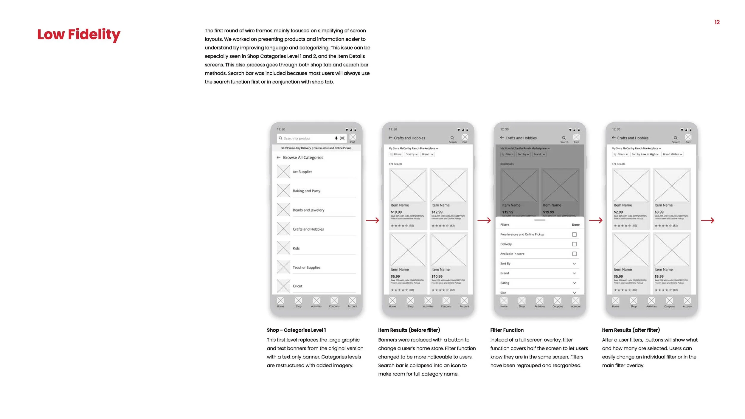
Low fidelity wireframes for my section